
Step 1: Create a new widget

Name it 'Shiny Image'.
Step 2: Add a content input
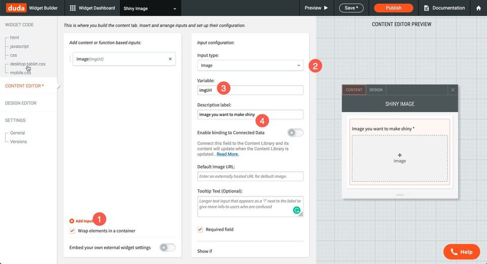
Add a content input for the image URL. Set the variable name to: `imgUrl`.
Step 3: Add HTML
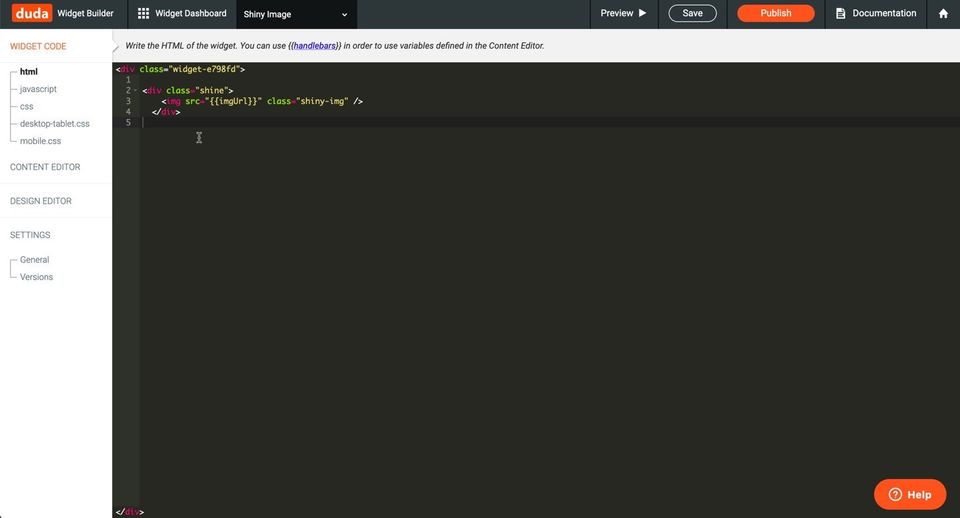
Copy the HTML code below into the HTML box. Notice the {{imgUrl}} which connects to the content input we've already created.

Step 4: Add CSS
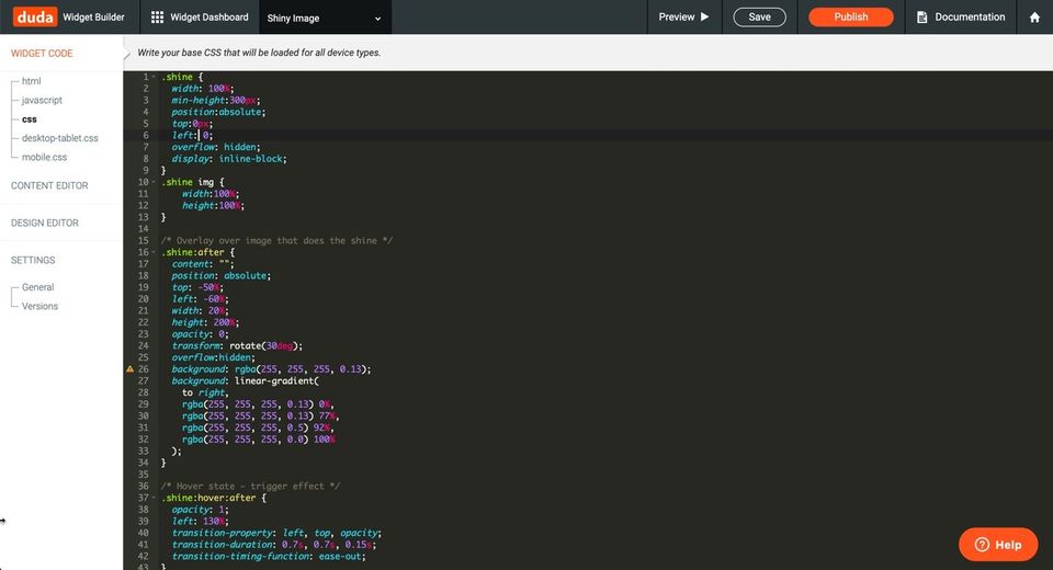
Copy the CSS (styles) below into the CSS file. This will add our shine effect.
 .shine {
  width: 100%;
  min-height:300px;
  position:absolute;
  top:0px;
  left: 0;
  overflow: hidden;
  display: inline-block;
}
.shine img {
    width:100%;
    height:100%;
}
/* Overlay over image that does the shine */
.shine:after {
  content: "";
  position: absolute;
  top: -50%;
  left: -60%;
  width: 20%;
  height: 200%;
  opacity: 0;
  transform: rotate(30deg);
  overflow:hidden;
  background: rgba(255, 255, 255, 0.13);
  background: linear-gradient(
    to right,
    rgba(255, 255, 255, 0.13) 0%,
    rgba(255, 255, 255, 0.13) 77%,
    rgba(255, 255, 255, 0.5) 92%,
    rgba(255, 255, 255, 0.0) 100%
  );
}
/* Hover state - trigger effect */
.shine:hover:after {
  opacity: 1;
  left: 130%;
  transition-property: left, top, opacity;
  transition-duration: 0.7s, 0.7s, 0.15s;
  transition-timing-function: ease-out;
}
/* Active state */
.shine:active:after {
  opacity: 0;
}
Step 5: Add JS

Add a small amount of JS. This sets the image height correctly to prevent issues editing within the editor once published.
 var imgHeight = $(element).find('.shine').height();
$(element).height(imgHeight)
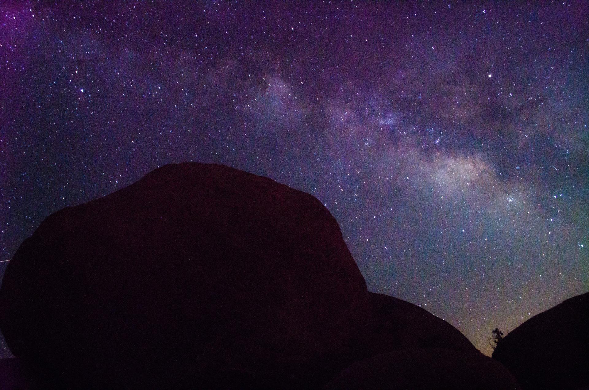
If you've done everything correctly, you should be able to preview and get the same effect that you get when you over the image below.
Step 6: Add Reverse Feature
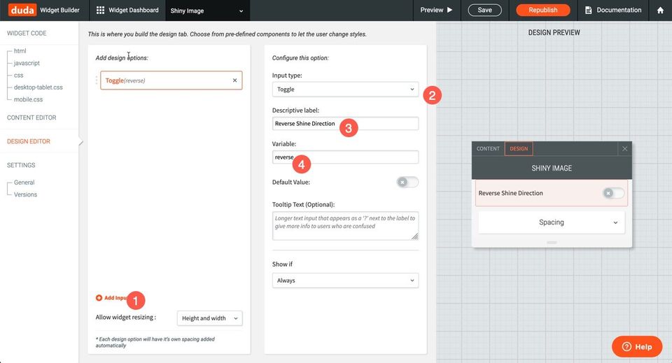
Let's add a design input this time to reverse the input and then update the HTML & CSS used to support the right or left shine.
 //new HTML
//new CSS
.shine {
  width: 100%;
  min-height:300px;
  position:absolute;
  top:0px;
  left: 0;
  overflow: hidden;
  display: inline-block;
  z-index:5;
}
.shine img {
    width:100%;
    height:100%;
}
/* Overlay over image that does the shine */
.shine:after {
  content: "";
  position: absolute;
  top: -50%;
  width: 20%;
  height: 200%;
  opacity: 0;
  transform: rotate(30deg);
  overflow:hidden;
  background: rgba(255, 255, 255, 0.13);
  background: linear-gradient(
    to right,
    rgba(255, 255, 255, 0.13) 0%,
    rgba(255, 255, 255, 0.13) 77%,
    rgba(255, 255, 255, 0.5) 92%,
    rgba(255, 255, 255, 0.0) 100%
  );
}
.left:after{
    left: -60%;
}
.right:after {
    right: -60%;
}
/* Hover state - trigger effect */
.left:hover:after {
    opacity: 1;
    left: 130%;
    transition-property: left, top, opacity;
    transition-duration: 0.7s, 0.7s, 0.15s;
  transition-timing-function: ease-out;
}
.right:hover:after {
    opacity: 1;
  right: 130%;
  transition-property: right, top, opacity;
  transition-duration: 0.7s, 0.7s, 0.15s;
  transition-timing-function: ease-out;
}
/* Active state */
.shine:active:after {
  opacity: 0;
}
Now we'll be able to reverse the direction of the shine effect.